Campus Colors: E-Commerce Redesign
Campus Colors Boutique offers a vibrant selection of women's clothing and accessories. After meeting the owner at her brick-and-mortar store, I was inspired to redesign the boutique's website to enhance the user experience and align it with modern trends.
Through comparative analysis, I identified key pain points and opportunities for improvement. I streamlined the navigation, optimized the landing pages, and improved the overall site UX with micro-interactions. The result will be a visually appealing, user-friendly website that should significantly improve customer engagement and satisfaction.
Responsibilities
Wireframing, Prototyping, Navigation Design, Content Organization, Visual Consistency
Team
Abigail Franks, Designer
Project Duration
3 Months

The Problem
Campus Colors Boutique's e-commerce website does not seem to be performing well, with users finding it difficult to navigate and use, especially on product category organization and filtering.
The site was also bogged down with too many pages, which can cause frustrated visitors and may often lead to lost sales. The goal of this project was to redesign the website to make it more user-friendly, easier to navigate, and more visually appealing, ultimately increasing customer satisfaction and sales.
The Soultion
-
Simple Mega Menu Navigation
-
Introduction of Micro-interactions
-
Site Redesign
Research
To ensure that Campus Colors Boutique's new website would meet and exceed industry standards, I conducted some comparative research. This involved analyzing several successful competitor websites to identify best practices and features that enhance user experience.
We focused on elements such as navigation simplicity, product presentation, checkout processes, and general optimization. I also wanted to find businesses with a lot of content.
These insights were crucial in guiding the design decisions, helping me implement effective solutions that would make Campus Colors Boutique's website meet industry standards.

✅ Visual Appeal: The website has a modern, design with high-quality images that enhance the shopping experience.
✅ Clear Navigation: Clear categories and filters make it easy for customers to find products.
❌ Price Perception: The perception of higher prices without corresponding perceived value can affect the user's decision to purchase.

✅ Advanced Filters: Filters include options such as category, size, color, price, brand, and customer ratings.
✅ Trustworthy Brand: Well-known and reputable brand in the online shopping, offering peace of mind to sellers.
❌ Pressure to Purchase: Some sellers may feel pressured to purchase due to excessive amount of pop-ups.

Solution #1: Mega Menu Navigation
To enhance the user experience on Campus Colors Boutique's website, we revamped the mega menu navigation. The previous design was cluttered and confusing, making it difficult for users to find specific products. Categories were not clearly defined, leading to a poor scanning experience.
In the new design, I introduced a clear, hierarchical structure that intuitively categorizes products, making it easy for users to quickly locate what they are looking for. The menu is contained within a dropdown, preserving space until needed.
Original Menu Design

New Menu Design


Solution #2: E-commerce UX Microinteractions
In the digital realm, success hinges not just on grand design, but also on the seamless integration of small yet pivotal elements.
In redesigning Campus Colors' site, I focused meticulously on these finer details, implementing a range of micro-interactions to enhance the user experience. By embedding these subtle yet powerful features throughout the site, the user journey becomes more intuitive and engaging.
Without these elements, an e-commerce site falls short of meeting modern users' expectations for interaction and engagement.
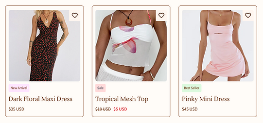
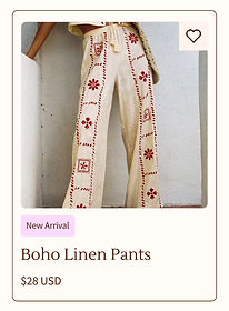
Tags
These unobtrusive labels provide users with instant insights into product attributes such as "New Arrival," "Sale," or "Best Seller." By seamlessly integrating tags into the browsing experience, I've empowered users to make informed decisions swiftly, amplifying their sense of control and satisfaction.
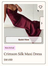
Quick View, Hearts, & Carousel
The Quick View, Heart, and Carousel functions are a prime example of how a small design elements can yield significant benefits. By enabling users to preview product images without leaving their current page, I've streamlined the browsing process, reducing friction and increasing chances of adding product to the bag.

Express Checkout Option
In today's fast-paced world, convenience is paramount. By incorporating express checkout buttons with ShopPay and PayPal, I've minimized the steps required to complete a purchase, catering to users who prioritize efficiency and speed without compromising on security or reliability.
Currency Conversion & Brand Header
In an increasingly interconnected global marketplace, catering to other currencies is essential. Building brand identity is fundamental to establishing trust and recognition. By incorporating an additional header for the brand name, I've ensured a consistent and memorable brand presence, while also allowing users to choose their country's currency.


Advanced Filters, Back to Top Button, & Information Accordion
Empowering users to find exactly what they're looking for is extremely important. Through advanced filtering options, I've provided users with granular control over their search parameters, enabling them to refine their search results based on various attributes such as size, color, and price range. Mini accordions serve as elegant containers for housing product details, FAQs, and other pertinent information. Lastly, smooth navigating through lengthy pages is essential for a great user experience. By incorporating a back-to-top button, users can effortlessly return to the top of the page after navigating through product.


Solution #3: Complete Site Redesign
To significantly improve the user experience and overall performance of Campus Colors Boutique's platform, I undertook a comprehensive site redesign. The previous website suffered from a dated aesthetic, disorganized navigation, and overall unintuitive shopping experience.
The redesign focused on creating a modern, clean aesthetic that aligns with current design trends and appeals to our target audience and adding in functionality to improve user's shopping journeys.
Additionally, we streamlined the checkout process to reduce friction and incorporated temporary high-quality images while waiting for new product photography.
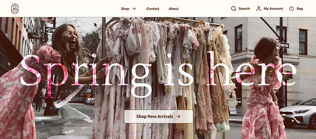
Landing Page

Quick View Modal

Individual Product Page


Product Categories


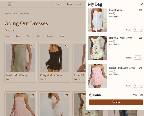
My Bag & Checkout

In Summary
I redesigned the website for Campus Colors Boutique after visiting their brick-and-mortar store and gaining inspiration from the owner. By conducting a comparative analysis, I identified key areas for improvement.
I streamlined navigation, optimized landing pages, and enhanced the overall user experience with micro-interactions. The new design is visually appealing and user-friendly, aiming to significantly increase customer engagement and satisfaction.